


The Best and Worst Chicago 2023 Mayoral Campaign Logos
Who would win if the 2023 Chicago Mayoral Election was decided by best campaign logo? It's not. And it shouldn't be. But what if it was?

My understanding of design, particularly political campaign design, has always been based in an undercurrent panic. Everything I know about design I learned while Googling “good direct mail Canva template not illegal” before the printer closes.
Ten years of communications strategy means that I’ve picked up some design knowledge, but most of it tends to be practical. Things like: “Ask people how much time they have to make edits before you start giving feedback” or “If you think the font is too small, show it to a senior. Then make the font bigger.”
In spite of my amateur design skills, I do think I know when a design doesn’t work, especially in niche Chicago politics.
And, over the years, I’ve often wondered about the design choices of Chicago politicians.
What makes for good design in politics? What makes us see a yard sign and go ‘Wow, that’s beautiful!’ or ‘Yikes, what happened here?’
With hours left until Election Day in Chicago, there are over 100 people are running for office. This includes those running for Mayor (there are 9 candidates still in the race), Alderman (there are contested races in over 38 wards), and those vying for new roles like police district council representative. It’s a momentous election for other reasons, too: almost all of the candidates running (except for two) are Black, the most in Chicago history, and there are 12 active aldermanic races.
All of these political campaigns — even the smallest campaigns with the most finite budgets — have a logo, a brand, and an overall political design.
But are these logos any good? I don’t know!
My ability to evaluate campaign logos during this particular election is clouded beyond my limited design prowess. 10 years of Chicago communications have left me with far too many biases — and unfortunately, most of the designers I know have similar biases. I can’t tell you if Kim Walz’s white and blue background is any good, because I’m too mad about DoorDash donating so much money to her campaign. A designer friend said she feels the same way about UWF-endorsed candidates, in reverse — she’s just excited to see movement friends’ names as logos.
With campaign mailers, yard signs, and social graphics about the 2023 Mayoral election taking over every door, street, and newsfeed in Chicago, I keep seeing logos and thinking:
“I wonder what a designer would think about that.”
So after angrily staring at one Mayoral Candidate’s sign for far too long, unable to quite articulate what annoyed me about the design, I realized it might be fun to ask a less biased, actual designer what they thought of all of the freaking yard signs plastered all over Chicago.
Better yet, to ask a non-Chicago designer what they thought — one with no preconceived notions about the candidates behind the logos.
Our Designer (and Judge)

Enter Stefan Davis, a political designer from Wisconsin. Stefan has developed brand identities for many progressive Wisconsin candidates, including Francesca Hong, Mark Fritsche, Syed Abbas, and Sally Beauchamp-Pope. His agency, Melee Creative, works with progressive candidates, mission-oriented businesses, and nonprofits on everything from brand development to website building.
“I’ve kind of done everything when it comes to design,” Stefan told me when we spoke via Google Hangout. “But what I like about doing design for progressive politicians is that both the candidate and I are invested in telling their story.”
I reached out to Stefan a few months ago after seeing his work on TikTok, and was struck by how he connected building relationships through organizing to creating good design.

And of course — Stefan lives in Wisconsin, so he’s relatively removed from the nuances of Chicago politics.
He did admit to watching City So Real, a fantastic documentary about Chicago’s 2019 mayoral election I recommend (as long as you have no history of activation regarding Chicago’s 2019 mayoral election).
“Other than that, the only thing I know of Chicago is that I love the punk rock scene from the late nineties,” Stefan told me. Perfect.
Why Campaign Design Matters in Elections
“Good logo design for political candidates is about creating a distinct and unified message,” Stefan says. Campaign branding includes logos, but it also includes color, spacing, and typography choices for all campaign materials, including social media and television advertising.
“I think sometimes politicians, in particular, forget that logo design doesn't just have to be about using big, bold text,” Stefan told me. “Ideally, there’s some meaning behind it that convey the candidate’s identity and values. It helps voters understand what the candidate is all about.”
Choosing the Best and Worst Chicago 2023 Mayoral Logos

For the sake of everyone’s sanity, I decided to limit Stefan’s logo review exclusively to the Mayoral race — reviewing 100-yard signs (not to mention me running around to take pictures of signs at major intersections) seemed like a crazy-making task.
Stefan’s goal: to decide the best and worst Mayoral campaigns in Chicago’s 2023 election, based exclusively on the quality of their campaign logos.
Here are the logos.
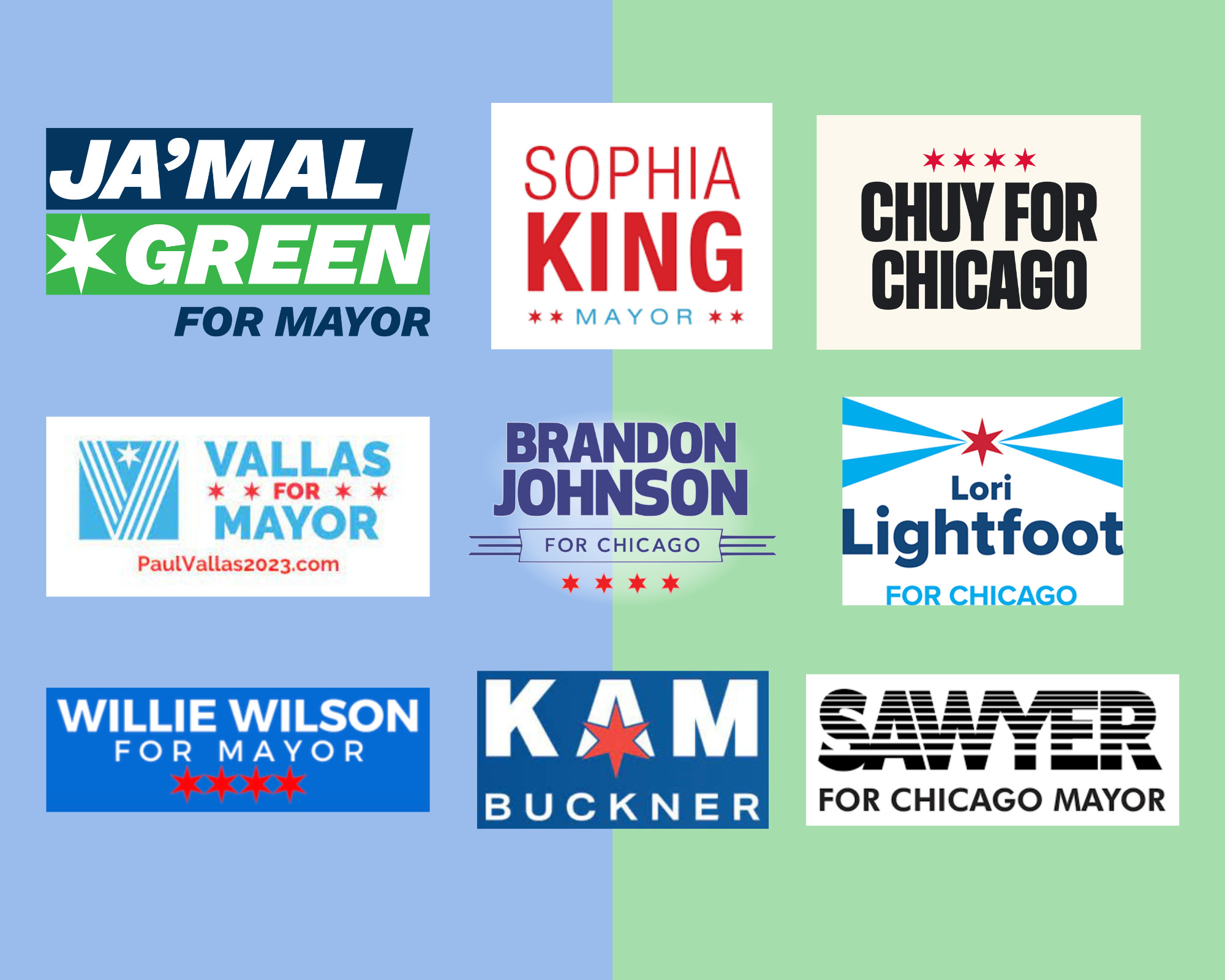
Kam Buckner
Stefan: This is like the Chicago flag, right? It's like this light blue thing with the stars if I remember correctly.
(Here’s the Chicago flag in case you need a refresher):

Stefan: Why is there so much space between Buckner and Kam? That's the first thing I saw.
Someone must’ve really fought for the star. They demanded to keep the star! But then someone else insisted on the last name.
You end up with this name in the middle, which is way too long for the star.
I would just get rid of the last name and it could just be Kam: that first name is so memorable and easy to read. There’s also a little bit of smushing that needs to happen here. I’m a self-taught designer, and I can’t remember the term, but the K and the N need to be closer to the A. Other than that, I actually don't mind this one.
Lori Lightfoot

Stefan: Oh man. I guess I do know one name in the Chicago Mayoral Race. It’s been hard to miss even nationally. Just to be clear, I’m basing my opinion entirely on design quality, right?
H: Yup, don’t worry about their politics or who they are as a person.
Stefan: <really big sigh>
Okay, so none of the other candidates have won with their logos — except for Lori Lightfoot. I would say she’s starting off on the right foot. When you have data behind what you've done, you should use it, and I imagine this is why she is using the same logo that she used in the last election.
This one is also really youthful. It feels bright to me. It's got this kind of shining star thing, and it reminds me of Chicago. It reminds me of what Chicago could be, what it might be now. You can see the cohesion there, right? With the light, and her slogan, ‘bring in the light,’ and her name, of course.
You know, I think she probably put some real money behind this logo and her brand. And that goes back to — if you’re running for office of any kind, you might think I’ll just use Canva. Why should I hire a designer?
You see why design matters when you compare Lori Lightfoot’s logo to everyone else.
With Lightfoot’s logo, someone is really thinking about the design, the themes, and the point of the campaign, and it pays off. Of course… you still have to be a compelling candidate.
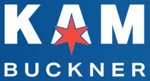
Willie Wilson
Stefan: This is a boring logo. The stars are way too close too together and too close to “for mayor”. There's no breathing room. This red and this blue clash so hard, even though it’s based on the Chicago flag. Honestly, this color choice drives me crazy.
I really fight this with clients when they choose these kinds of colors. And if they end up choosing it, I figure out a way to design it without the blue and the red ever touching each other. It drives me crazy.
I'm just gonna say straight up, I hate this logo. There's nothing good about it.
The only thing I like is the font of “Willie Wilson.” It's a Sans Serif font.
…It’s not a great sign when the only good thing I say is I like that they used a sans-serif font.
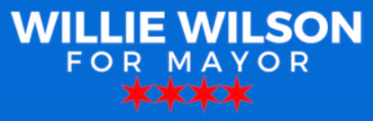
Sophia King
Stefan: Huh. This — so. It seems like all of these mayoral signs and logos look the same. They're all using these same stars, those colors.
I wonder if someone tried to not use these stars if they would get fewer votes or more votes. Has anyone done a study?
Still — I like the way she used red as the font color. She’s using the Chicago colors without as much clashing. I love the tracking on Mayor, and the stars are good. In terms of spacing: I would probably get rid of Sophia or get rid of King. Both are really distinct, and I doubt there’s another King or Sophia running. Either way, if you shorten the text here you have more room for something dynamic.
This is a plain logo, right? It's not perfect, but it fits on a yard sign.
That's kind of your first goal as a political designer: make sure that this design fits well on a yard sign. The rest can work itself out.
Ja’Mal Green
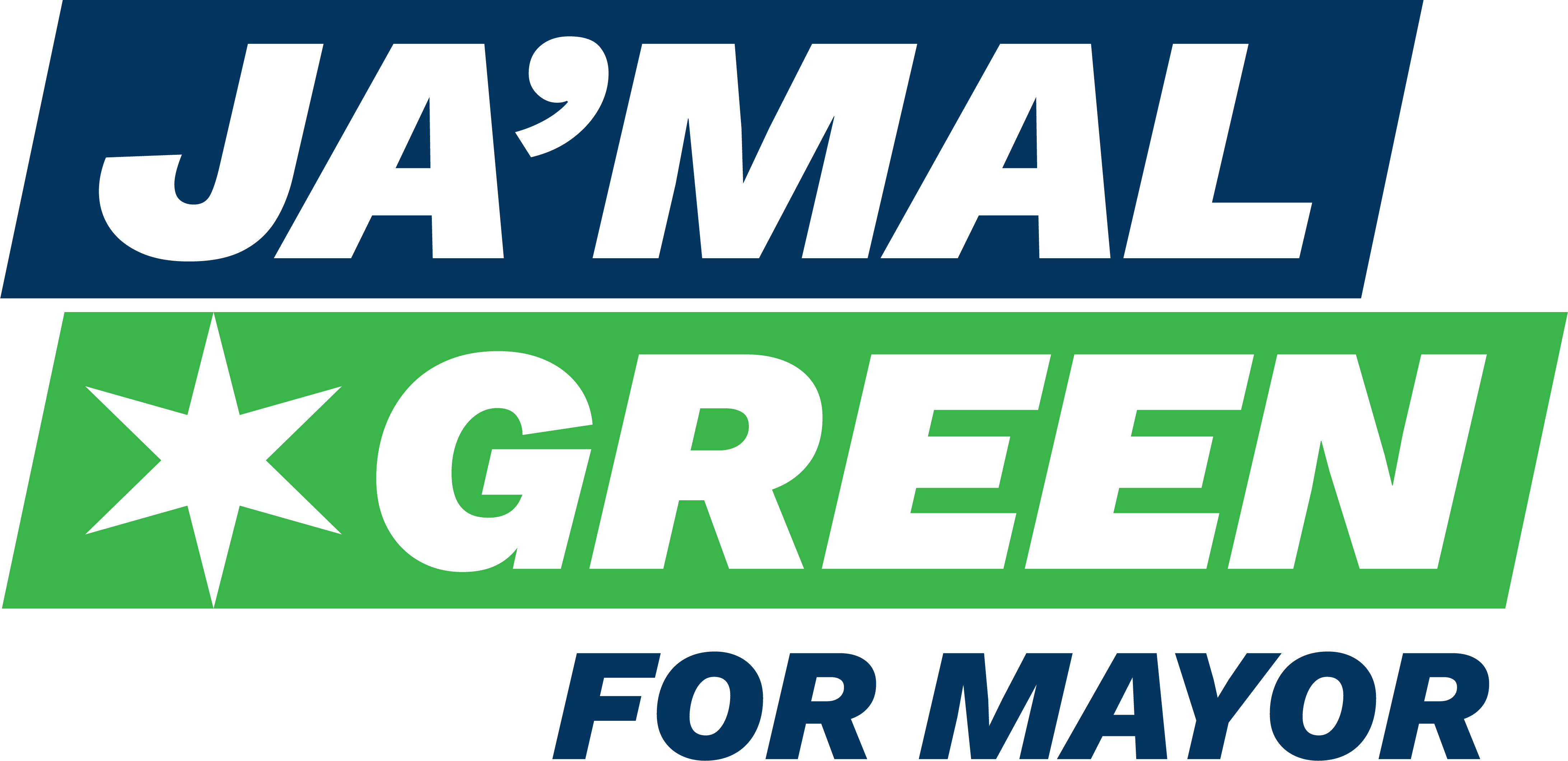
Stefan: I like this! This logo really stands out in terms of color. We keep seeing that light red and blue of the Chicago flag, but this is different.
I always like an italic font because it shows forward movement.
The problem here is that you've got all these weird angles: when other people adapt your logo, trying to put it on mailers and social media for endorsements, they’re going to use a square template, and it will be easy for their angles to be off.
Note: When I tried to make a social media graphic with all of the mayoral logos for this article, I immediately cropped Ja’Mal’s logo in a way that cut off the angle just as Stefan predicted. Sorry, Ja’Mal Green. Sorry, Ja’Mal Green’s designer.
Brandon Johnson

Stefan: There are the stars again. I guess I like “For Chicago.”
I’m just gonna say it: it’s boring.
A lot of times when I see something for the first time, I'm like, I hate this. Then I look at it for four more seconds and I'm like, Okay, there's actually nothing wrong with it. It gets the job done. That’s what I’m feeling now. I think sometimes this very minimal logos can work, especially with very grassroots teams (who I work with a lot) or people running for office for the first time.
I hope Brandon Johnson is an exciting candidate. If he is, then this logo could really work. But if Brandon Johnson is a total bore fest, then, uh, I assume he will have trouble with this logo.
But — it’s fine. It's okay. I don’t know, — it kind of looks like something you'd see in an airport.
Paul Vallas
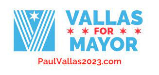
Stefan: The Chicago flag colors really clash but everybody really wants to use them!
Other than the colors, I would get rid of 2023: if you put that on a sign then decide you wanna run again in 2027 — any left are still gonna say 2023, everything is gonna say 2023, and you have to start all over.
I made this mistake in the past, actually. This candidate won her primary but lost in the general. She ran again in 2022, but of course, we had 2020 on the goddamn yard signs. We ended up crossing out the 2020 and writing in ‘22 with a Sharpie on all of them, and it became kind of a funny design distinction. But it was still a pain.
Overall this logo isn’t bad, but it’s not a great political logo specifically. It seems like would work better for some sort of manufacturing company.
Chuy Garcia
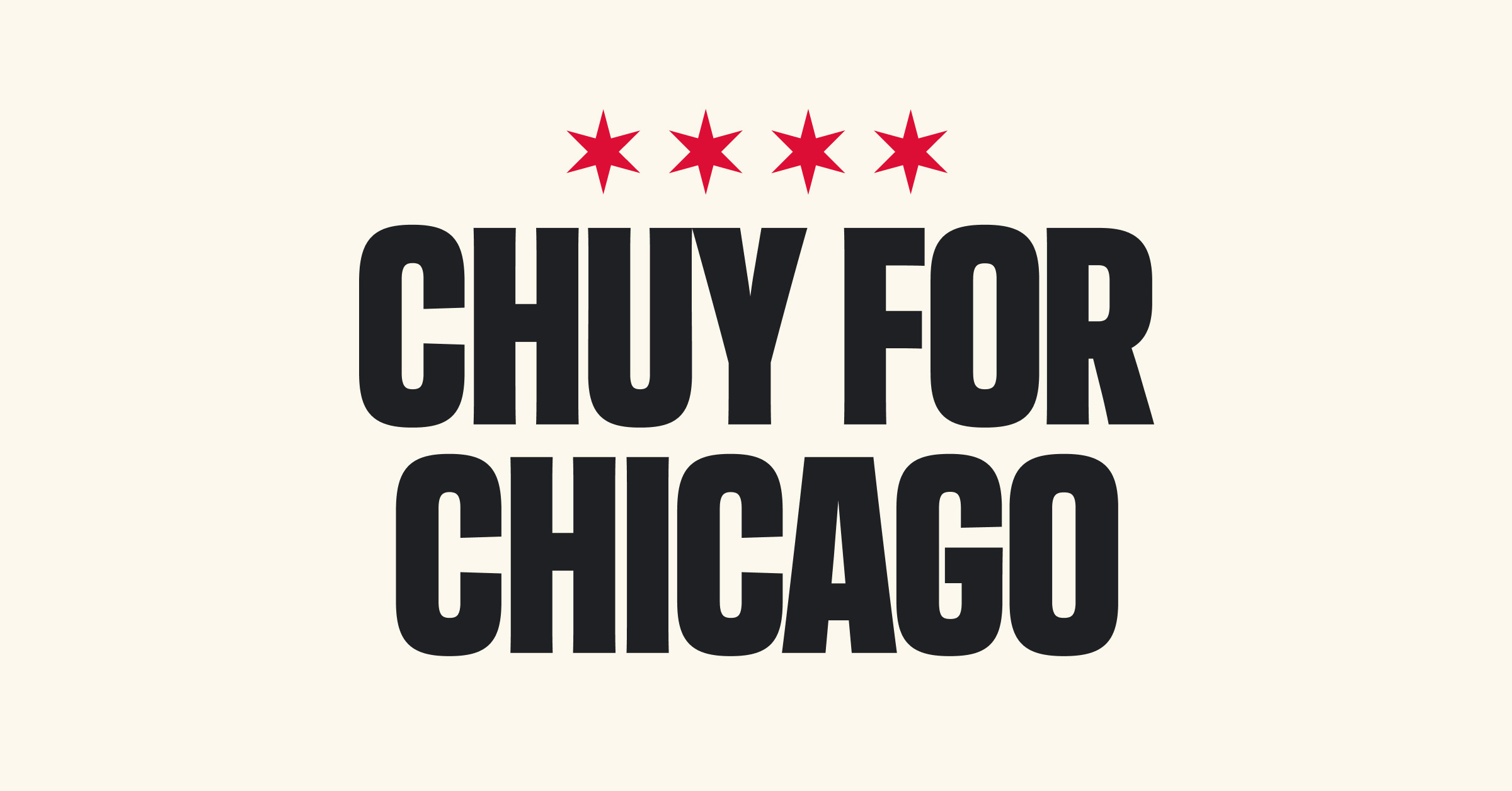
Stefan: I like this one a lot. It's so simple. New designers often want to make everything the same width and flatten it all out with spacing. I’m saying this because I often made this mistake in the past. But this designer didn’t flatten the whole thing out or make each line the same width, which ends up really powerful.
This is my favorite so far. I know lots of designers would look at this and go, it's super boring, but this is exactly what you want for a political logo. If you put this on a yard sign, it really stands out, even in the snow.
This is a perfect logo for politics <laugh>.
H: Because you mentioned font — do you have strong feelings about all caps or lowercase? Either way?
Stefan: Well, when you go small caps on a sans serif font, it's pretty youthful, which is good. But I don't think Chuy wants to go for that, based on what you said and what I’m seeing from the logo. He wants to go for, I am the candidate that has the reputation, the experience, the wisdom — that kind of thing.
Note: I decided that showing Stefan any variations on each candidate’s yard signs would distract from his broader points about branding. But — I passionately believe everyone should see this sign from Chuy, which one anonymous city expert described as ‘The kind of thing made for voters in neighborhoods like Mount Greenwood, but for some reason, Chuy only put them in neighborhoods nothing like Mount Greenwood.’

Thank you.
Roderick Sawyer

Stefan: This is just the IBM logo. My first thought is it's a printing company <laugh>. But this is also not a great logo for a printing company.
It’s really bad. I mean. Wow.
I wish I had more to say.
The Best 2023 Chicago Mayoral Candidate Logo
Stefan: It's a tie between Chuy and Lightfoot, for completely different reasons.
I feel like I'm a little biased because Lightfoot is the current mayor, and I know that she won with this logo.
Politicians are hesitant to change their branding after they've won a race: if you have any data at all that shows what you’re doing is working, design-wise, you should keep doing it.
But that attitude can also can get politicians in trouble: it keeps them from updating their logo and brand to fit the times.
Lori Lightfoot’s logo says it's gonna be a brighter future with me.
And Chuy is saying, let's get back to the way things are done in Chicago.
The Worst 2023 Chicago Mayoral Candidate Logo
Stefan: Sawyer. 100% Sawyer. All of the other logos, they could be fixed. But with Sawyer — I'd start from scratch.
H: Were there any other signs you had a strong reaction to?
Stefan: Brandon Johnson. His logo bugged me because it was so boring — you know that old trope, 15 seconds I'll never get back? That's how I felt about Brandon Johnson’s logo. I spent 15 seconds staring at it thinking, this is boring. But again — it felt like a new candidate to me and sometimes design < everything else.
What Makes A Good Political Logo?
Stefan: Ultimately, we're all trying our best, you know? There's no reason to mock other people's design work.
Still, I think you can see from looking at all of these logos together that intention really matters when it comes to political design. What you put out about your campaign, what it looks like, what it communicates to voters — it matters.
Political design is about getting people elected, so you’re a politician or you're thinking about getting into the design side of politics: don’t worry about what other designers think, or having the flashiest design.
Keep it simple. Keep it bold. Make it fit on a yard sign.
H: Anything else you want to say about political design, campaign logos, or the Chicago Mayoral race?
Stefan: I want somebody in Chicago to run and win with a logo that doesn’t include those six-point stars in any of their campaign design. Be bold!
Go Vote!
A record-setting number of people have already early voted in the 2023 Chicago Election — almost 178,110 ballots had been cast on Friday, triple the number of early ballots cast in 2019 or 2015.
If you’re not one of those early voters, it’s not too late: you can find your polling place here and make a plan to vote by Tuesday (February 28th) at 5:00 PM.
Other Election Intel
General Platform Guidance: Design matters, but please do not vote based on design. This election matters a lot, particularly the aldermanic races: 12 different wards will have new alderpersons (alderpeople?) for the first time in a decade.
More information about every candidate’s platform, including those running for the weird new offices like police district council, is available here.
Lefty Platform Guidance: If you’re a progressive (or leftist) that doesn’t follow local politics at all, you should check out the Girl, I Guess Guide.
Runoff Election: Don’t worry: if you can’t get enough of voting and election chaos, any candidate that doesn’t get more than 50% of the votes on Tuesday will head to a runoff election on April 4. That means they will continue to campaign for another 2 months. Fun!
More Sign-Based Criticism: This article is based on a Twitter thread ranking county seals across Illinois. Thanks to India Daniels for linking when I couldn’t find it anywhere — and for generally being a civic production whiz.
If you enjoyed this piece and want to receive emails from me about Chicago politics or what you can learn about organizing communications from the hit Showtime series Yellowjackets, sign up for my newsletter below:
This interview has been condensed and edited significantly so you don’t have to read a bunch of long pauses where I’m clicking around in the privacy settings of every single image I sent Stefan.